
echarts
CSS flex布局
flex布局基础
任何一个容器都可以指定为flex布局
1 | // 盒状模型 |
注意,设为Flex布局以后,子元素的float、clear和vertical-align属性将失效。
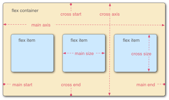
容器属性
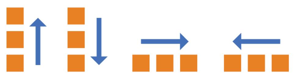
flex-direction
1 | // 主轴方向 |
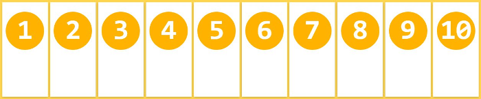
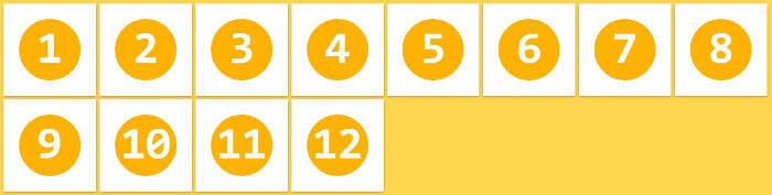
flex-wrap
当主轴排列不下所有子内容时,flex-wrap决定如何换行
1 | .box{ |
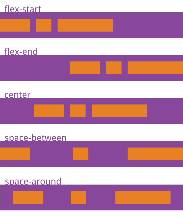
三种分别对应:
flex-flow
1 | // flex-direction与flex-wrap的合并写法 |
justify-content
1 | // 定义主轴上的对齐方式,默认为flex-start |
align-items
1 | // 定义主轴在cross轴上的对齐方式,默认为stretch |
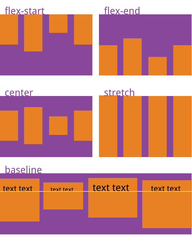
- flex-start:交叉轴的起点对齐。
- flex-end:交叉轴的终点对齐。
- center:交叉轴的中点对齐。
- baseline: 项目的第一行文字的基线对齐。
- stretch(默认值):如果项目未设置高度或设为auto,将占满整个容器的高度。
本博客所有文章除特别声明外,均采用 CC BY-NC-SA 4.0 许可协议。转载请注明来自 Ando's blog!